HTC Touch Review
The HTC Touch was just launched in Malaysia last week and I had a chance to test one out courtesy of YeapCH.com
The first thing that struck me was that it was really small and sleek, and came in an attractive matte black box. I think the Touch biggest selling point is that it is small and sexy, and dressed in black! Hardware wise it isn't really much different from other WM6 devices.

Top marks for the presentation box
 It's small and the rubbery surface gives it a firm hold. The casing is firm and does not creak under pressure. The touch screen dominates the front. I like the screen, it is very clear and has good visibility under normal lighting.
 The screen is a fingerprint magnet so after all that "touching" you will have to clean it up a bit. A quick wipe on your shirt will do the trick!
 Nothing much at the back except for the camera.
A thin band of chrome lines the device. The buttons part of the chrome strip. Here the power button is located at the top.

Two tiny rectangular buttons flank the D-pad. Fortunately the directional pad is quite responsive. The small buttons however do not give much tactile feedback at all.

A 2MP camera is the main feature of the otherwise smooth back. Unfortunately it is not an autofocu camera and does not take macro pictures.

There is actually a full sized, non-telescopic stylus that they have snuck into the side. Nice touch!

The plastic back cover is quite hard to slide off because of it's firm fit. The 1100mAh battery, SIM card and microsd slots are hidden inside.
A video of the TouchFlo interface. See just how fast the Touchflo can go!

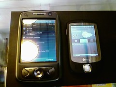
A few comparison shots to show the dimunitive size of the Touch. Here it is next to my Dopod 838 pro/ HTC Hermes.


And next to a standard lighter.

Flame vs Touch
Originally uploaded by docfiles.
A side by side picture of the small touch and the big flame!
In conclusion, the touch looks good and feels good. Now if only it were priced lower than it's RM2099 tag. Good for the fashion conscious, but not for the power user.


1 Comments:
Please review new pda phone in the market eg Samsung sghi-780, LG, htc much cheaper.
Post a Comment
<< Home